IDONTMIND
Building a 0→1 interactive mental health mobile companion meant to be deleted.

Role
Product Designer, Contract
Timeline
Nov. 2023 - Jun. 2024
Team
4 Product Designers
10 Developers
Skills Leveraged
Product Design
Product Strategy
UX Research
Project Overview
IDONTMIND is a 501(c)3 nonprofit organization with a mission to inspire open conversations about mental health. Launched in 2017, the campaign has 148,000 followers. Over the 2023-24 school year, my team at LA Blueprint developed a fully functional mobile application for IDONTMIND..
As a designer, I worked closely with the non-profit to evaluate the core needs of their organization and helped propose a feasible technical solution to be built out in less than a year. We designed the app from zero to one, along with a full-scale design system and design documentation to help ensure that the product can be sustained by the non-profit long term.
NPO CONSULTATION
Defining the problem space with our non-profit partner
Early conversations at the inception of our partnership with IDONTMIND revealed that...

The main issue was that IDONTMIND's resources were split between two platforms: their Instagram, which prioritized visual appeal over in-depth information, and their website, which suffered from low traffic and lacked essential functionality, such as a search feature.
Centralization
They lack a way for their community to engage with all of IDONTMIND's resources in-depth. Instagram prioritizes visual appeal over information.
Personalization
They are looking for ways to provide support in a manner that feels more personal and empowering. Instagram does not allow for a personalized algorithm catering to each user's needs.
World Application
Their current model makes it difficult for users to engage interactively in ways that fit their lifestyle. The next item on their business roadmap is something transportable: a mobile application.
II. COMPETITIVE ANALYSIS
Examining the competing mental health market
For the duration of one week, we went undercover to conduct an analysis of eight mental health competitors that offer similar services. This analysis helped us identify commonalities that suggested features to incorporate in our product, as well as aspects to avoid.


III. CONTEXTUAL INQUIRY
Let's try to understand what real potential users are looking for
To better understand the range of our audience's perspectives and experiences with mental health technologies, we interviewed four members of IDONTMIND's Youth Impact Team, who specialize in promoting mental health awareness. An interesting trend we observed was that despite working for the non-profit, none of the four Youth Impact members actively used specific IDONTMIND resources, as doing so involved either sifting through a cluttered Instagram feed or navigating an outdated website.


Human-to-Human Connection
"I always prefer to reach out to a friend when I need to rant, but sometimes I don't want to feel like I'm a burden on them, so I journal on my own."
Be mindful of content and personalizations
Easy to put down = mission accomplished
"Being an entrepreneur, I'm always on the go. If I'm going to use another app, it should strike a balance between being routine-based, but not chore-like."
IV. AFFINITY MAPPING
Taking all the pieces and assembling the puzzle
While our biggest findings were listed above, our interviews gave us much more data to play around with and group specific ideas together.
V. USER PERSONAS
Putting names and faces to our insights
To further synthesize our research findings and allow our team to more effectively empathize with our users, we created personas to humanize the various mental health needs people might have coming into the app.
VI. OUR PROPOSED SOLUTION
A temporary mobile mental health companion that's meant to be deleted.
After analyzing feedback from user interviews and collaborating closely with IDONTMIND's stakeholders, we identified key opportunities to not only address unmet needs in the market, but also tackle the specific challenges highlighted by our users. These insights helped us land on a welcoming companion app that upholds these guiding design principles:
Design to be deleted.
Design an experience that supports users in stepping away from the app permanently and returning to their daily lives feeling more balanced and healthy.
01
Tailored user experience.
Compile actionable, personalized resources and trend analyses based on check-in responses. Include the option to censor certain topics to avoid potential triggering content.
02
Keep it human.
The app should evoke the feeling of catching up with a good friend (who's done their psychology homework of course!) who is available 24/7 in times of crisis.
03
Listen, don't judge.
Provides a no judgement space for users to reflect with holistic wellness check-ins and journal prompts. Users can choose what the want to answer and what they don't.
04
VII. HOPPING INTO FIGMA
Putting pen to paper — or more like — ideas to wireframes
A peek at just a few of our low fidelity wireframes. We iterated upon hundreds of screen when balancing between visual explorations, functionality, and interaction flows. Note: This project exposed me to the world of edge cases that come along with building an app from scratch
From the start, we faced pivotal design challenges that directly influenced the product's strategic direction. Below are some of the critical questions we tackled and how our early wireframes served as a foundation for aligning design decisions with the overarching product strategy:
How might we …
set users up to use the app with intention?
Communicate the purpose of the app within the onboarding process. Utilize data-backed research for our product algorithm.
How might we …
prevent check-ins from feeling like a chore?
Randomly shuffle prompts each day. Minimize pressure by providing option to skip check-ins and come back later.
How might we …
display IDONTMIND's vast library of content?
Worked with developers to file all content data under relevant tags (ex: creativity, anxiety, etc.) and overarching subcategories (ex: emotions). Users can search, filter, and browse by tags.
These answers were able to further define our product strategy and determine how certain features would interact moving in to mid-fidelity designs.
VII. USABILITY TESTS
Understanding user behaviors and patterns
Once we finished prototyping an MVP, we shared our working prototype with six participants to see where our users may be having trouble. Interviewees cited that the new app was generally intuitive, easy-to-use, and engaging. Whilst there were some points of confusion for certain features, such as the organizational flows or unclear bits of copy, their feedback helped guide our design decisions as we iterated on our final designs.

IX. ITERATIONS
Weighing tradeoffs through the lens of our users
Rethinking the content organizational system.
Participants found the sheer amount of resources in the Content Library overwhelming, to the point where they omitted using the current organizational system entirely.
II. Having more user-centric copy throughout features.
Participants expressed that they wouldn’t always want to add their own custom titles for journal entries, and wondered what types of attachments would be supported by the journal feature.
III. Iterating on how to present functional and clear metrics.
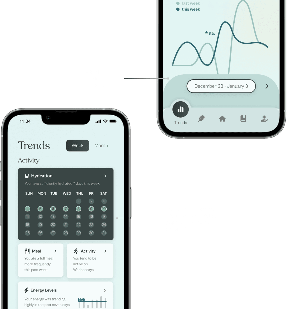
Participants expected the iconography on the trends landing page to be tappable/interactive and difficult to adjust the time frame within the trends page.
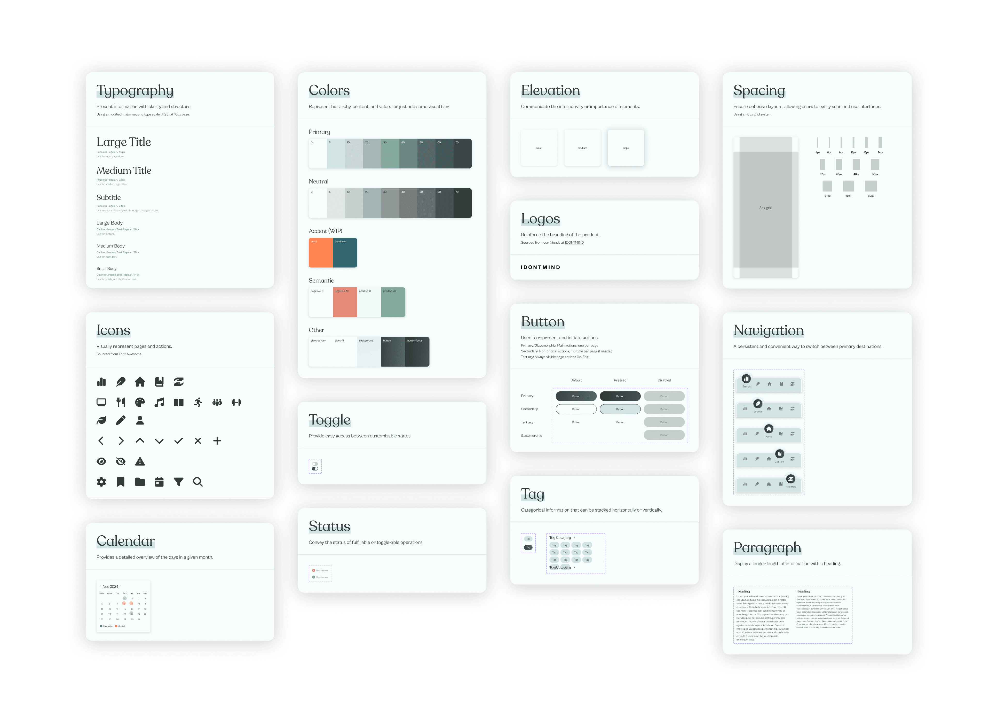
X. DESIGN SYSTEM
Crafting a visual identity that is scalable and sustainable
One of the biggest considerations we had when making this design system was allowing future teams to easily build, adapt, and extend the app’s visual and functional components after deployment. Thus, we tried to be as detailed as possible with when and where to use components.
XI. FINAL PROTOTYPE
Introducing the IDONTMIND mobile companion!
Onboarding Flow
A welcoming process that assures users they are the ones in control and can choose to omit content that may be triggering to their specific mental health needs.
Check-In Flow
Users start with daily check-ins that algorithmically taper off as emotional regulation improves, following our finding that we want users to get off the app healthily.
Content Flow
Includes resources from IDONTMIND’s platforms, picked specifically to support, empower, and challenge the user, based on their daily check-ins and trend analyses.
Trends Flow
A dashboard showcasing weekly and monthly trends, enabling users to track changes in their wellness over time. Based on emerging patterns, personalized resources and actionable guidance are offered to either reinforce positive behaviors or help course-correct as needed.
XIII. THANK YOU
What's next on the horizon
The IDONTMIND app is currently being deployed! With our designs and code finalized, we're working on getting our app on the Apple and Google stores. To my amazing team—I couldn't have asked for a more chaotic, yet hard working group of people to make work sessions go by.
Taking the time to reflect
Think end-to-end; this was my first 0 to 1 product. It challenged me to think holistically, considering business and stakeholder impacts, as well as how the design will scale in the future.
Compromise; collaborating with developers for the first time taught me the value of adapting designs to fit project constraints, pushing me to problem-solve and adjust solutions on the spot in conjunction with feasibility.
Bring intentionality; I had to consider many tradeoffs in the creation of this product. Weighing these tradeoffs through the lens of users and their behaviors was crucial, regardless of how minute they seemed.